Trading Card Variations: Decode Parallels, SPs, and Value
Pull up a chair and set your stack on the mat. If you have ever stared at two cards that look almost identical and wondered why one buys lunch and the other pays for a weekend away, welcome to the world of trading card variations. The hobby learned that small, intentional changes in finish, image, numbering, ink, or embedded material can turn a common into a chase. Once you learn to read those signals, you start moving through a box like a seasoned dealer. You grin at the right moments and you pass politely on the rest.
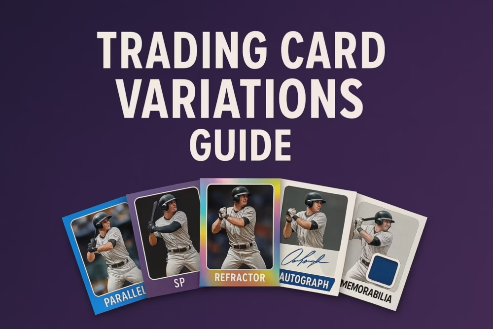
What we mean by “variations” in the hobby
Think of a base card as the original melody. Variations are the remixes. Some add chrome shine or a patterned foil. Some swap the photo and hide a short print in plain sight. Others add a serial number that states exact production. A few carry on‑card signatures, sticker autos, or slices of game action in the form of patches and floor. Learn the cues and value starts announcing itself from the card stock. For a quick manufacturer primer on parallels, see Topps Ripped: New Collector’s Guide to Parallels.
Base cards: where every rainbow begins
Base is the template. It is the photo and layout you memorize so your eyes catch deviations later. Even if you never chase every parallel, a clean page of base cards reads like a yearbook. It is the before photo for every rarity that follows.
Parallels: the color wheel that keeps collectors up at night
A parallel keeps the same number and image as the base card but changes the finish. Expect silver shine, bold colors, or textures that ripple under a desk lamp. In chromium products the family grows quickly: Refractor, Prism, Negative, Sepia, RayWave, Lava, Mini‑Diamond and many color tiers from Aqua and Blue to Green, Gold, Orange, Red, and Black. These tiers often include serial numbers that reveal precise scarcity. To see a year‑specific menu and pack odds, check set pages like BaseballCardPedia: 2024 Topps Chrome. As manufacturers add more colors, demand tends to concentrate in the lower numbered tiers such as Gold, Orange, Red, Black and of course 1 of 1.
Refractors and Prizms: the shimmer that changed how we look at cards
Here is the technical part, minus the lab coat. A Refractor is a card printed on chromium stock with a micro‑structured, light‑reactive finish that produces rainbow shine when tilted. The effect is not simple gloss. The surface is engineered to bend and reflect light so you see a shifting spectrum that collectors can spot across the room. The first Refractors appeared in 1993 Topps Finest and were not even labeled as such, which is one reason early copies cause double takes today. For a concise overview, read Wikipedia: Refractor card and a collector‑oriented history at All Vintage Cards: Refractor Guide.
Refractor families split into unnumbered and numbered tiers. Unnumbered examples include base Refractor, Prism, Negative, Sepia and retail exclusives like RayWave. Numbered tiers run through Aqua and Blue to Green, Gold, Orange, Red, Black and finally the one of one Superfractor with its signature gold spiral pattern. For a visual, multi‑year look at color names and patterns, see BallcardGenius: Refractor types; for exact contents and odds in a specific release, consult set pages such as 2024 Topps Chrome.
Panini uses “Prizm” for a similar light‑reactive concept because “Refractor” is a Topps trademark. A Silver Prizm is roughly analogous to a base Refractor, then the ladder climbs through a dizzying array of colors and patterns that culminate in Gold out of ten and Black Finite one of one. If you want the naming context and brand history, read Cardlines: Panini “Refractors” Explained and a current example of deep parallel trees in ChecklistInsider: 2024‑25 Prizm Black. One practical show‑floor tip: in Topps Chrome, a true base Refractor usually says “Refractor” on the back under the card number. Image variations can still be shiny on the front yet omit that little word on the back, which is your clue to flip again, check the code suffix and grin. Beckett demonstrates those tells clearly in Beckett: 2023 Topps Chrome Variations.
Short prints and super short prints: the photo that hides in plain sight
Some variations whisper instead of shouting. An SP or SSP keeps the same number but swaps the photo. Designers love to sneak in candid grins, street clothes, or city‑themed nods. The key is learning the base image first so the alternate jumps out. Many years include specific back‑code endings that confirm SP or SSP. A recent flagship example embraced the obvious with gold backs and clear SSP marks in the Golden Mirror program. For visuals, see Beckett’s Chrome guide and Cardboard Connection: 2023 Golden Mirror SSPs.
Serial numbering: the small slash that changes the conversation
Nothing clarifies scarcity like a foil‑stamped fraction. 14 slash 99 is the fourteenth of ninety nine. 03 slash 10 is the third of ten. One slash one needs no speech. Collectors love jersey number matches and the bookends of a run. For a crisp overview of how these numbers function in the market, try CardSZN: What Serial Numbers Mean and this practical beginner’s view at Sporting News.
Printing plates: one of one from the press room
Plates are the actual metal sheets that lay down cyan, magenta, yellow and black layers during offset printing. When production ends, those plates become unique inserts that carry the scuffs and roller marks of the job itself. They connect your collection directly to the manufacturing process. A clear primer on plates and how they enter the hobby lives at Cardboard Nerds.
Autographs: the pen stroke that turns cardboard personal
Ink comes two ways. On‑card means the player signed the card face. Sticker means they signed a clear label that was applied later. One feels like a handshake, the other like a signed note carefully framed. Both are legitimate. On‑card usually blends better with design and carries that I‑was‑there feeling. Stickers keep checklists deep and redemptions down. For balanced explainers, read Cardlines: On‑Card vs Sticker and Topps Ripped: On‑Card vs Sticker.
Relics and patches: flip to the back and read the story
The front shows a patch. The back tells you why it matters. “Game used” or “game worn” ties the swatch to moments that counted. “Player worn” often means a photoshoot or event. Text that says the material is not associated with any specific player, game, or event is honest but less romantic. The market is increasingly fluent in this language, asking how items were sourced and tracked. For a clear overview of why wording matters, see Sports Illustrated: The Truth About Patch Cards.
Rookie cards, RC logos and the first card that really counts
Rookie cards are the first major licensed base cards after a player reaches the top level. MLB’s 2006 rules standardized the RC logo. In baseball, Bowman’s “1st Bowman” mark appears earlier on prospects and can become the early‑career grail if the player becomes a star. For consistent definitions and history, see BaseballCardPedia: Rookie Card and Topps Ripped: 1st Bowman.
Errors and corrections: the hobby’s blooper reel
Sometimes the presses blink. A missing name, a reversed negative, a typo that turns into folklore. If the factory fixes the problem mid run, the short window of errors becomes scarce and very collectible. For a practical look at how SPs, SSPs and corrections appear in modern flagships, start with Cardlines: Topps Short Prints.
Case hits and SSP inserts: art that announces itself
Designers save a few showstoppers for once‑per‑case or tougher. Comic style explosions, clean silhouettes on white with color bursts, or cityscapes woven behind a player. They are not always numbered, yet they build reputations fast. When an insert becomes the face of a product, the right player in that design becomes a centerpiece. For an overview of case‑hit seeding and why it matters, read Cardlines: Ultimate Guide to Case Hits and the art‑focused perspective at CardSZN: Alt Art and Case Hits.
Ultra rare icons: the final boss tier
Every era crowns a few cards that sit above the rest. In chrome, the one of one Superfractor with the golden spiral pattern is the daydream. A famous example is the 2009 Bowman Chrome Draft Mike Trout Superfractor autograph that sold for about 3.94 million dollars in 2020. See Beckett: Trout Superfractor Record. In 90s basketball, Precious Metal Gems are cultural artifacts with green copies limited to the first ten and red copies finishing the run to one hundred. PSA’s profile explains why these remain grails decades later at PSA CardFacts: 1997–98 PMG Profile.
Want to dig deeper
Helpful reference reading
- Beckett: Topps Chrome Image Variations
- All Vintage Cards: Refractor Guide
- Cardboard Connection: Refractor History
- PSA CardFacts: 1997–98 PMG Profile
- Wikipedia: Refractor card
Recommended Listings
One last veteran tip. Protect cards the moment they leave the pack. Surface scratches and corner nicks are slow leaks that drain value while you are not looking. Keep supplies within arm’s reach so you reach for them by reflex.
- Standard penny sleeves that fit snug and slide without scuffing
- 35 pt and 55 pt top loaders for base and common chrome thickness
- Team bags to seal stacks or slabs and keep dust out
If you ship or grade often, semi‑rigid holders and painter’s tape are quiet heroes. Semi‑rigids make grading submissions smoother. Painter’s tape keeps resealable bags tidy without glue residue on holders. Your future self will thank you later.
- Semi‑rigid card holders for submissions
- Painter’s tape and storage boxes for organized shipping and storage
Leave a Reply